- About Us
- Privacy Policy
- Shipping and Returns
- Terms and Conditions
- Custom Quotation
- Sample Pack
- Contact Us
- Blogs
© 2025 Copyright. All rights reserved.

Choosing display packaging boxes is not simply a matter of selecting an attractive color or adding a logo. The box must protect the product, support retail presentation, and communicate your brand within seconds. A strong choice begins with practical questions: Where will the box be displayed? How much weight will it carry? Will customers see the product clearly? These details often matter more than decorative effects.
Packaging and graphic design authority Robert L. Peters wrote, “Design creates culture. Culture shapes values. Values determine the future.” His point applies directly to display packaging boxes. A matte paper finish can suggest quiet luxury, while a bold window and bright print may create a more energetic impression. Materials also affect trust. Recycled board, water-based inks, accurate labeling, and verified supplier claims can strengthen credibility. Ask for documentation, not promises.
A perfect box rarely exists.
Your decision may involve compromises. A large display window can improve visibility but reduce structural strength. A rigid box may feel premium but increase shipping weight and cost. Before approving production, request a physical sample. Check the folds, opening experience, print color, adhesive quality, and shelf stability. Place it under real store lighting. It may look different there.
This guide explains how to compare size, structure, materials, finishes, sustainability, and manufacturing reliability. It also considers your product’s price point and customer expectations. The best display packaging boxes do more than hold merchandise. They make the product easier to notice, easier to understand, and easier to trust.
How to Choose Display Packaging Boxes for Your Brand?
Understanding Your Brand’s Packaging Goals
Choosing display packaging boxes starts with a clear understanding of your packaging goals. A box should protect the product, explain its value, and support the shopping experience. In my packaging projects, I have seen attractive boxes fail because they ignored shelf space, opening habits, or product weight. Good design begins with practical questions. Will the box sit on a counter or hang on a display wall? Does the customer need to see the product before purchase? Can staff open and restock it quickly?
Your answers should guide the box structure, material, printing, and finishing. A lightweight product may need a simple folding carton with a clear window. A heavier item may require reinforced panels and a stronger base. Measure the product carefully, including inserts and protective wrapping. Small errors can cause movement inside the box. That looks careless.
Think about your audience too. Clear typography helps shoppers understand essential information quickly. Consistent colors and shapes can improve recognition without making the package crowded. However, visual appeal is not enough. Packaging goals should include durability, production efficiency, storage, and responsible material choices. I once preferred a complex structure because it looked impressive, but testing revealed slower packing and higher waste. That decision needed rethinking. Create a sample, test it on a real shelf, and ask independent users to open it. Their hesitation may reveal more than a polished presentation.

Choosing a display packaging box starts with the product’s size, weight, and selling environment. A box that looks elegant online may fail under bright retail lighting. Measure the product, including inserts, labels, and protective space. Then test several styles before approving artwork. Small changes matter. A tuck-end box suits lightweight items and stacks neatly on shelves. A window box gives shoppers immediate visibility, but it may weaken structure if the opening is too large. Rigid boxes feel substantial and protect premium goods, although they require more storage space.
Your display format should match how customers handle the product. Countertop displays work well for compact items near checkout areas. Floor displays offer stronger visibility, yet they must resist tipping and repeated contact. Hanging boxes save shelf space and present the front panel clearly. They are less suitable for heavy products. Consider the viewing angle, reach height, replenishment speed, and number of units per facing. I have found that a beautiful box can underperform when staff cannot restock it quickly. That detail is easy to miss.
Before production, create a physical sample and inspect it in the actual display location. Check color under store lighting, opening force, edge durability, and barcode readability. Ask a packaging specialist to review the structure and material choice. Do not rely on digital images alone. They hide weak corners. Test transport vibration and moderate humidity, too. A format may look efficient on paper but waste space during shipping. Revise the design when evidence challenges the original concept. That is useful packaging discipline.
| Box Style | Typical Display Format | Recommended Product Profile | Visibility Level | Consumer Access | Typical Retail Placement | Material Efficiency | Best Use Case |
|---|---|---|---|---|---|---|---|
| Countertop Display Box | Open-top or front-facing tray | Small, lightweight products with frequent purchase cycles | High | Very easy; products can be picked directly | Checkout counters, service desks, reception areas | High when flat-packed and correctly sized | Impulse purchases and limited-space retail displays |
| Floor-Standing Display Unit | Multi-shelf or tiered freestanding structure | Medium-sized products or several product variants | High | Easy; multiple facings can be presented at once | Store entrances, aisle ends, promotional zones | Moderate; requires stronger board and structural support | Seasonal campaigns and high-volume product launches |
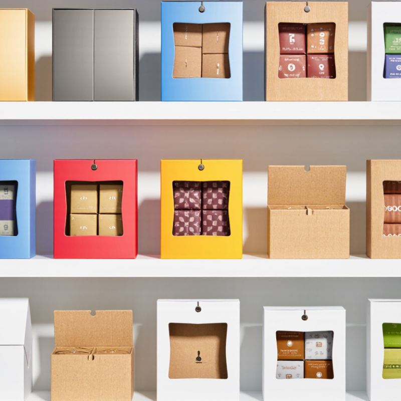
| Window Box | Retail shelf box with a transparent viewing panel | Products where color, shape, finish, or accessories influence purchase | High | Moderate; product remains protected inside the box | Standard shelves, specialty stores, gift sections | Moderate; the window adds material and converting requirements | Products that benefit from direct visual inspection |
| Sleeve and Tray Box | Printed outer sleeve combined with an inner tray | Premium, giftable, or presentation-focused products | Medium | Moderate; opening usually requires removing the sleeve | Gift shops, premium shelves, e-commerce-ready displays | Moderate to low; uses multiple components | Layered presentation and elevated unboxing experiences |
| Hanging Carton | Retail peg display using a hang tab or Euro slot | Small, lightweight, compact products | High | Easy to view; access depends on the closure design | Pegboard walls, narrow aisles, compact accessory sections | High for lightweight items and efficient shelf utilization | Maximizing vertical visibility in limited shelf space |
| Dispenser Box | Open-front carton with a tear-away or guided dispensing panel | Small, repeat-purchase items packed in consistent units | High | Very easy; products are dispensed from the front | Countertops, service areas, wholesale shelves | High when the carton is optimized for shipping and display | Maintaining product order while supporting self-service sales |
| Tuck-End Folding Carton | Individual shelf-ready carton | Small to medium products requiring protection and stacking | Medium | Moderate; access requires opening the carton | Supermarket shelves, pharmacy shelves, general retail | High; efficient for flat shipping and automated production | Balanced protection, branding area, and distribution efficiency |
| Rigid Setup Box | Premium shelf or gift presentation box | Fragile, high-value, or presentation-sensitive products | Medium | Moderate; usually opened manually | Premium retail, gifting displays, showroom environments | Low to moderate; rigid construction uses more material and shipping space | High-end presentation and enhanced perceived product value |
Planning guide: visibility, material efficiency, and access ratings are comparative design indicators. Final selection should also consider product weight, dimensions, protection requirements, shelf regulations, shipping conditions, replenishment method, and available display space.
Choosing display packaging boxes starts with the product and its selling environment. Recycled paperboard suits lightweight items and supports a clean, natural appearance. Corrugated board offers better protection for heavier products or long-distance shipping. Kraft surfaces feel warm, but they may show color variations. That is not always a flaw. It can make the package feel more honest. For moisture-sensitive products, add a suitable coating and test it before production.
Size affects both protection and presentation. Measure the product, including caps, labels, and small accessories. Leave enough space for padding, but avoid oversized boxes that waste material. A well-fitted box reduces movement on the shelf. Consider the viewing angle too. A front window, open display panel, or raised insert can make the product easier to notice. Structural details, such as locking tabs, dividers, and reinforced corners, improve stability without adding excessive layers. I once approved a box that looked attractive but tipped forward on a retail shelf. The design needed another practical review.
Tips: Build a physical sample before placing a large order. Check the box under bright store lighting. Test stacking, opening, carrying, and closing several times. Inspect the edges after transport simulation. Small weaknesses often appear there. Ask the packaging supplier for material specifications and tolerance ranges. Do not rely only on computer drawings; real products rarely behave perfectly.
A display packaging box must attract attention before a shopper reads every word. Graphics should create a clear visual path from the product name to its main benefit. Use strong contrast between the background and lettering, especially under cool store lighting. Small text often disappears from two meters away.
I have learned this through packaging reviews and shelf tests. A bright color may look excellent on a screen but appear dull on recycled board. Request a physical proof before approving production. Check the box from different heights and angles. Keep the key message near the front-facing panel. Use one dominant image, not several competing graphics. White space also matters. It gives the design room to breathe.
Recognition depends on repeated visual decisions. Consistent colors, shapes, typography, and image styles help shoppers identify related products quickly. However, consistency should not become rigid. I once approved a design with attractive details that became invisible after folding. The mistake was obvious later. Measure safe areas around creases, windows, and hanging tabs. Test readability with ordinary shoppers, not only design professionals. Ask what they noticed first, then compare their answers with the intended message. Some feedback may challenge your assumptions. That is useful. A reliable design earns attention without shouting.
Display packaging should protect the product and support a clear buying decision. In production trials, I have found that attractive structures can hide expensive details. A die-cut window, raised logo, or complex insert may increase tooling and assembly costs. Request a complete quotation, including setup fees, sampling, printing, finishing, packing, and delivery. A low unit price can become misleading when minimum order quantities are high.
Material choices also affect environmental performance. Recycled paperboard may reduce virgin material use, but its strength must match the product weight. A 350gsm board can suit lightweight items, while heavier products may need stronger construction. Avoid unnecessary plastic windows when the product remains visible through an open display design. Water-based coatings are worth reviewing, yet they may not provide enough resistance in humid storage conditions. Sustainability requires practical testing, not attractive claims.
Production requirements should be checked before approving artwork. Confirm board thickness, folding direction, color tolerances, barcode readability, and assembly steps. I once approved a compact box that looked efficient on screen, but its narrow locking tabs slowed packing. The design was technically correct, but operationally weak. Ask for a physical sample and test it on the real packing line. Check compression, shelf stability, transport vibration, and opening performance. Small flaws become costly at scale.
© 2025 Copyright. All rights reserved.

Magento Catalog Menu Widget by EMThemes Magento Themes & Magento Templates